Background
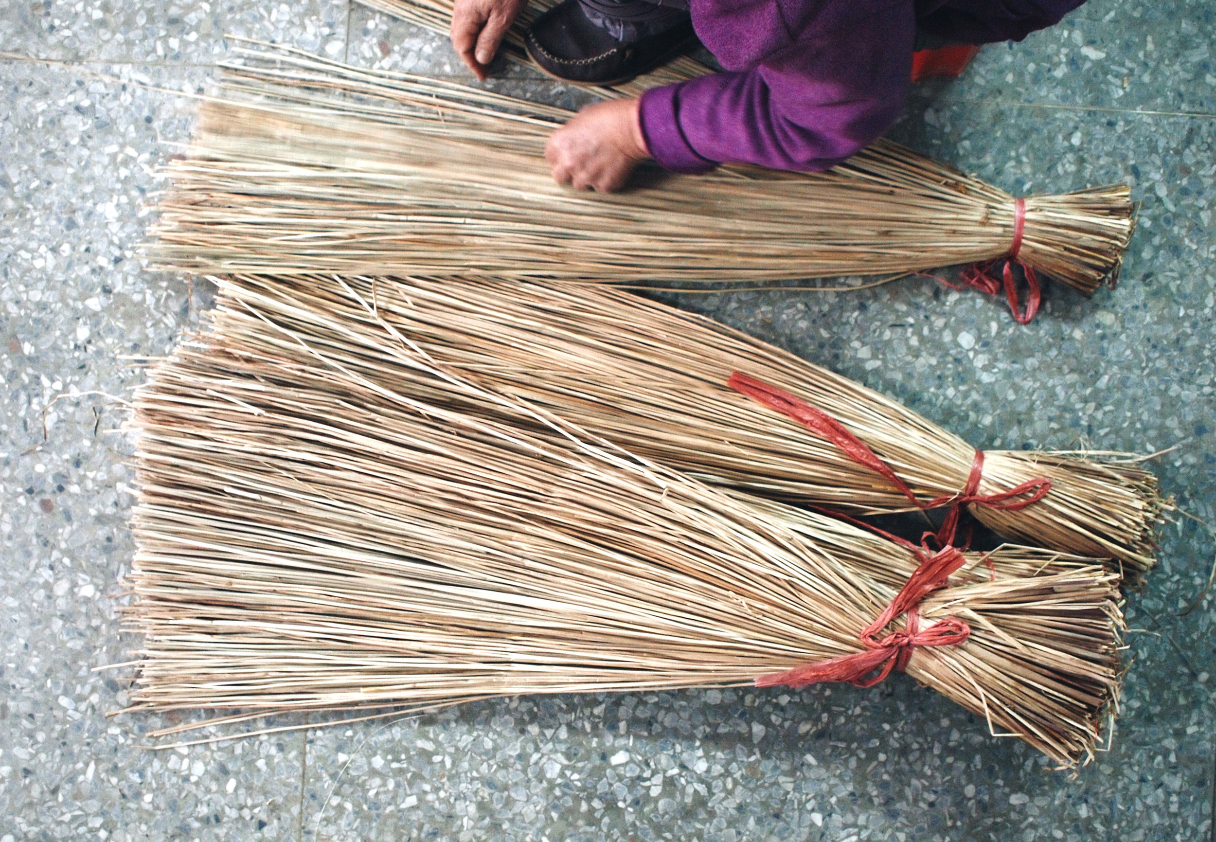
A lifestyle brand gaa founded by a Taiwanese designer Chia-En Lu in Helsinki. She is keen to forge modern designs while incorporating traditional hand-made artistry, to showcase it to a new audience in a stylish way. I was commissioned to design the visual identity for the brand.
MY ROLE
Concept | Art Direction | Visual Design

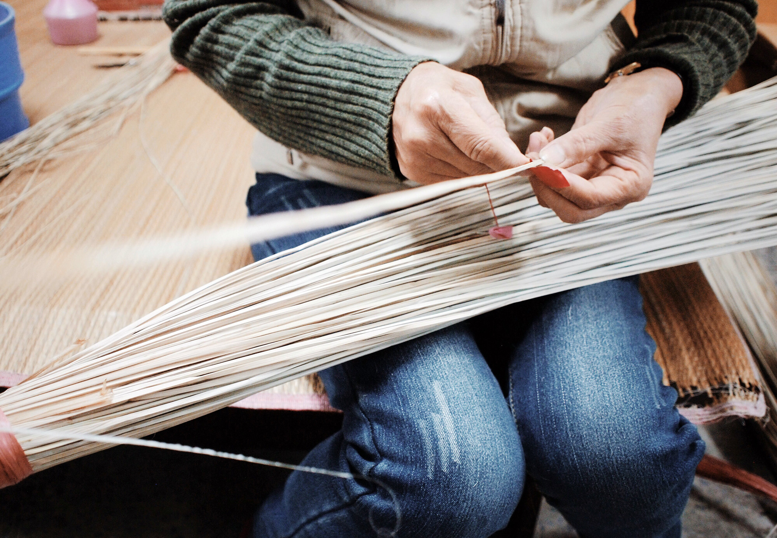
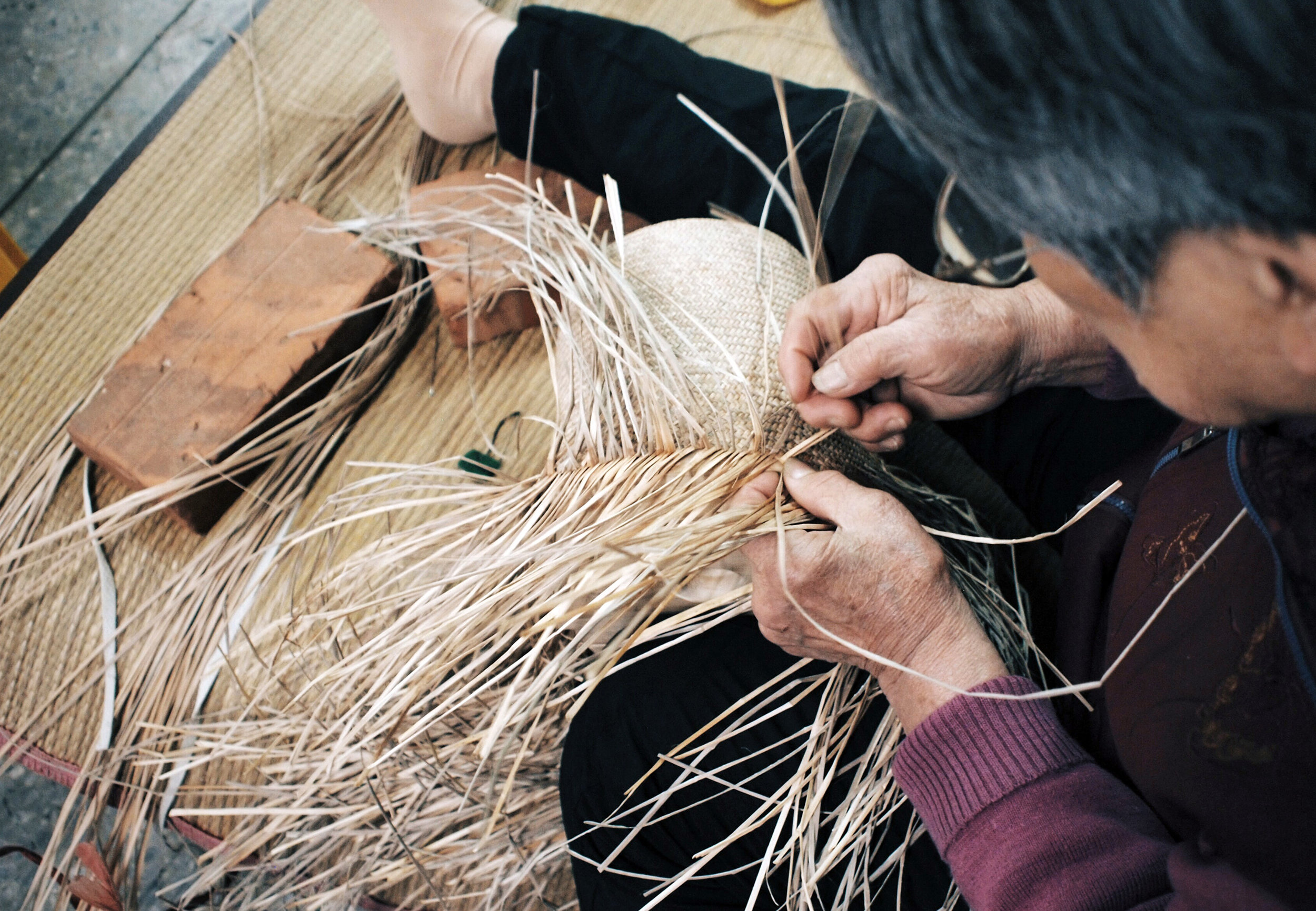
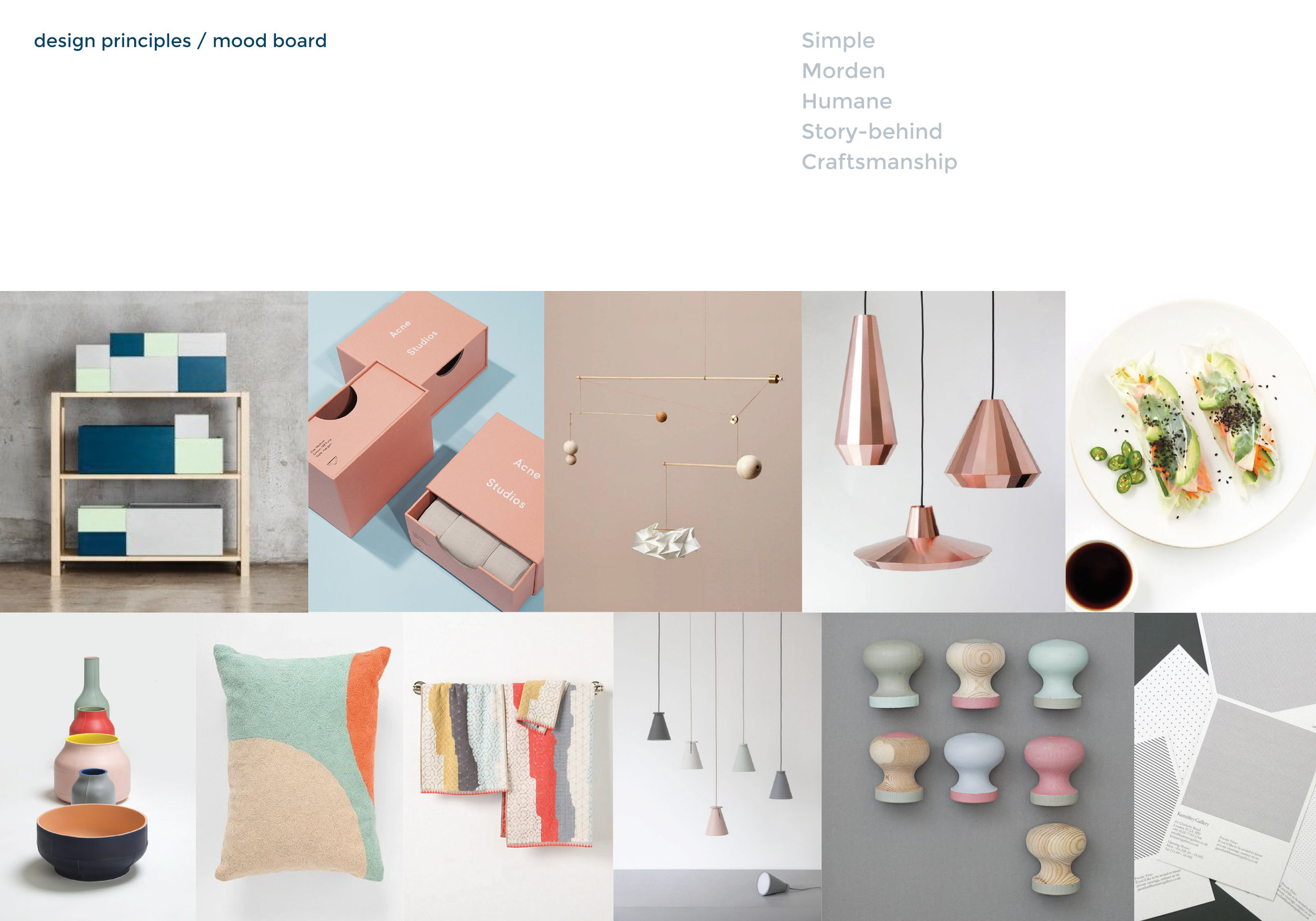
We work closely to explore the tone of the voice and key visual ideas. I put together the mood board to visualize the visual direction. Gaa means home in Taiwanese dialect, so one approach is to imagine gaa as a symbol of home; the other is to explore the weaving technique. In the end, we think it's essential to present the brand name so that people can read it, therefore, memorize it easily. Consequently, we decided on a logo that looks like a woven alphabet formed by geometry to communicate the modern yet humane core sprits.
To harmonize with the logo, I selected the san-serif fonts, which are modern, friendly, and highly legible. The color palette represents the hybrid of the contemporary Scandinavian and Taiwanese design. The printing of the stationary uses black hot foil stamping to symbolize craftsmanship which is the key emphasis of the brand.